Changing the typographic landscape of a country: one letter at a time
Posted by Remya Padmadas on December 14, 2016by Pooja Saxena

Pooja Saxena makes and works with typefaces, especially those in Indian scripts. See her work here, or follow her on Instagram.
My interest in designing typefaces in Indian scripts grew out of years of disappointment with the way most Hindi books I came across looked. Apart from a few exceptions, they looked like poor cousins of English books. Whether it was a children’s story book or a novel or magazine, there was usually the same drab typeface. Some letters didn’t look like what we were taught in school, on others the matras (vowel marks) didn’t arch at the right places. Overall, the books and the letters inside them had an air of neglect. They looked old and completely unexciting. When I first learned that designing typefaces was a real job, I thought here was the opportunity to change all that.
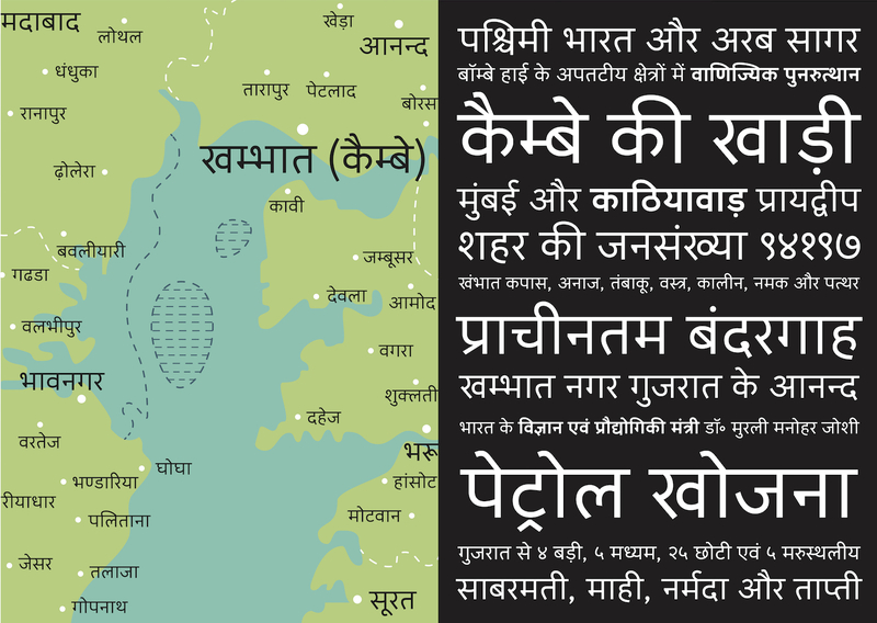
Cambay, Devanagari typeface designed by Pooja Saxena for Google Fonts
Changing the typographic landscape of a country as diverse as India is not a one-woman job, but every now and then a project comes by that has the potential to make a small difference. Two years ago, as a result of a conversation with Subhashish Panigrahi, the Access to Knowledge programme at the Centre for Internet and Society commissioned a Ol Chiki typeface family. The Ol Chiki script, about which I knew precious little at the time, is used to write the language Santali, which is spoken by over six million people in India and its neighbouring countries. At the time that we started working on this project, there was no Unicode compliant typeface available in the script, making it impossible for it to be used on computers and cellphones, and online in a consistent and future-proof way. We hoped to change that by designing a small, but useful typeface family (it comes in regular, bold and italics) along with input methods and keyboard layouts that would allow a person to type Ol Chiki text easily.
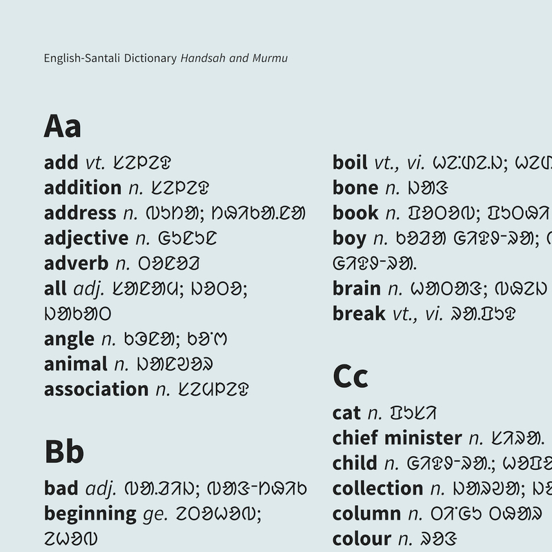
Guru Gomke, Ol Chiki typeface designed by Pooja Saxena with research inputs from Shubhashish Panigrahi,
for the A2K Programme at the Centre for Internet and Society.
This project was especially challenging because not only was Ol Chiki a completely unfamiliar script to me and Subhashish, but there was limited material available for us to consult. While designing a typeface in a script one reads and/or writes, or is at least familiar with, one’s experience with those letters can act as a guide. By writing them and seeing them printed in different fonts, in many people’s handwriting — some good, some bad — and on hand painted signs, one develops an instinct for identifying which parts of a letter make it recognisable. That way we know what parts of the letter can be exaggerated, and what others can be played down without compromising legibility. For an unfamiliar script, this visual vocabulary and the traditionally correct way of writing letters must be learned. Manuscripts, printed documents, handwriting manuals and samples, metal type, linguistic information about the script, feedback from native readers — all form parts of a puzzle that needs to be put together to design a competent typeface.
The story of Ol Chiki script is fascinating. The script is less than a century old, and was devised by Pandit Raghunath Murmu, who wanted to create a script that could accommodate all the features of the Santali language — something that the scripts used to write Santali so far had failed to do. Legend has it that he based the design of the letters on objects commonly found in the everyday environment of the Santals. Even though the script was created between 1920 – 1940, the Santal community has many myths about how it was created. One says that the script came to be at the time when the Earth itself was created, another says that the script was given as a divine gift to a learned man, Pandit Raghunath Murmu. It is after Pandit Raghunath Murmu, who is reverentially called Guru Gomke, that the Ol Chiki typeface that I designed was named. You can find out more about the Ol Chiki typeface and input methods project here.
Custom lettering for the Tamil branding of the Coovum Art Festival, designed by Pooja Saxena
If you’re interested in Indian type design and le ering, consider following the work of these exceptional designers — Noopur Datye, one of the co-founders of type design collective, Ek Type, who has designed custom typefaces TV channels like LifeOK; Kimya Gandhi, who is partner at Mota Italic, and recently designed an inventive Devanagari handwriting font; or Lipi Raval, whose flamboyant Gujarati typeface Mogra is a complete head-turner.
Be the first to comment.