Art thou ready for our first ever Illustrator Workshop!
Posted by Sherein Bansal on November 20, 2018Written by Sheena Deviah, Art Director, Pratham Books
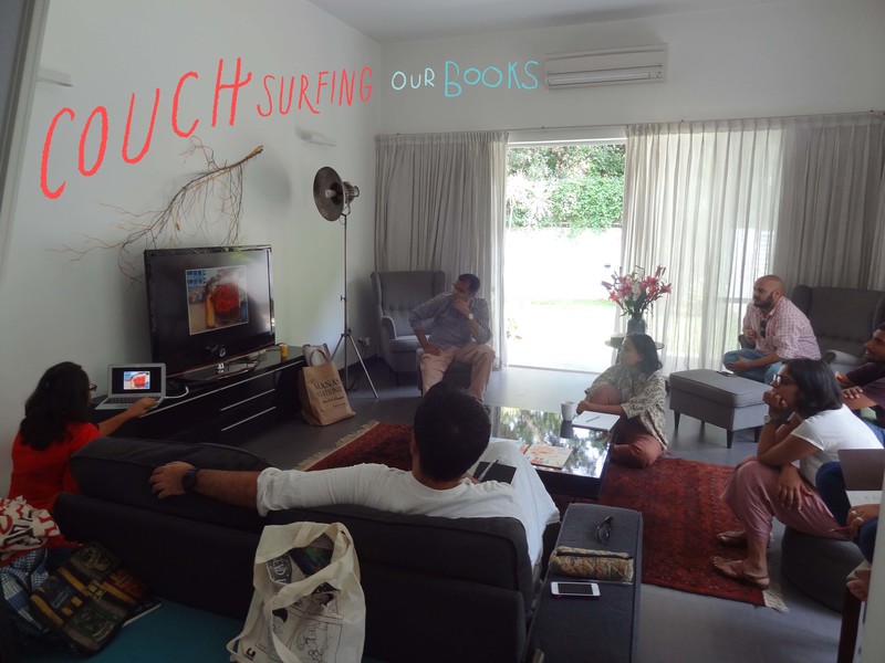
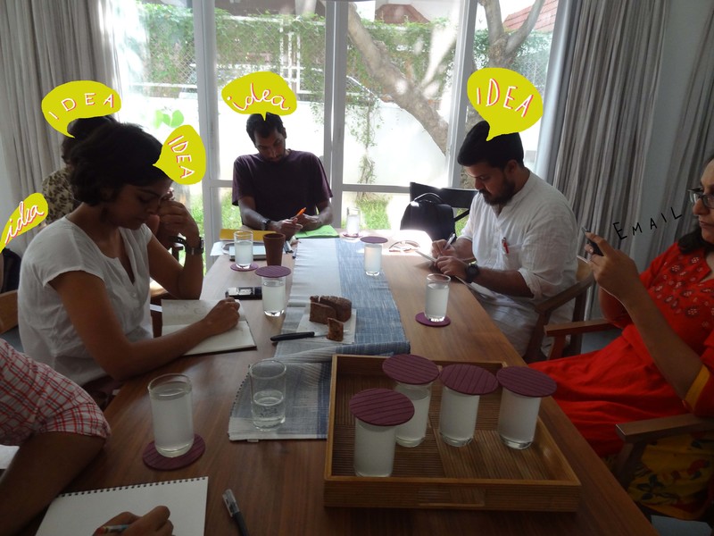
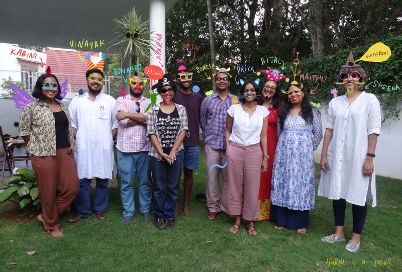
This year, over two balmy days in May, we teamed up with the talented Vinayak Varma to conduct an immersive workshop with a bunch of extremely talented illustrators. The participants were Priya Kuriyan, Rajiv Eipe, Somesh Kumar, Sunando C and Kabini Amin and the workshop was led by Vinayak. Fun and snacks were had by all.
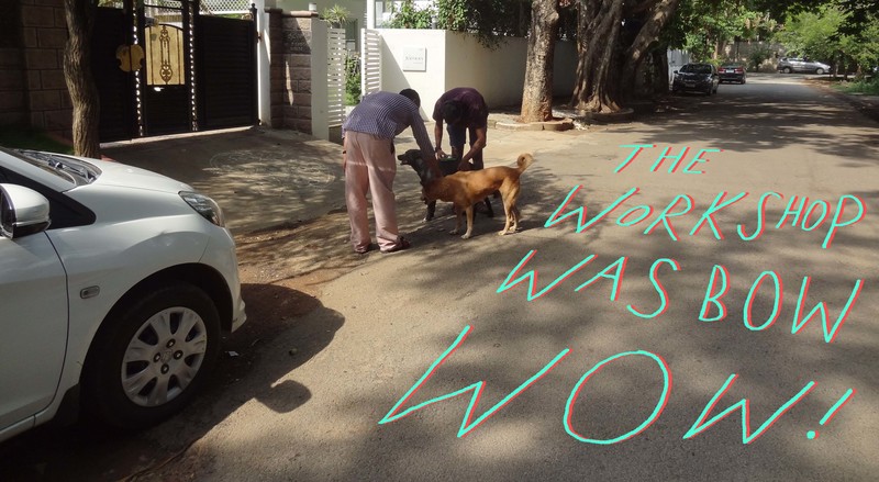
This workshop has led to the zany Bow Meow Wow by Priya, the lovable Khusar Pusar by Somesh and a couple more that will be up on StoryWeaver very soon.
Here’s what happened in picto-typographical form!
Lettering: Sheena Deviah
Photos: Aparna Kapur, Vridhhi Chaudhry
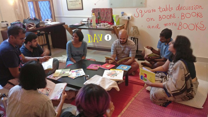
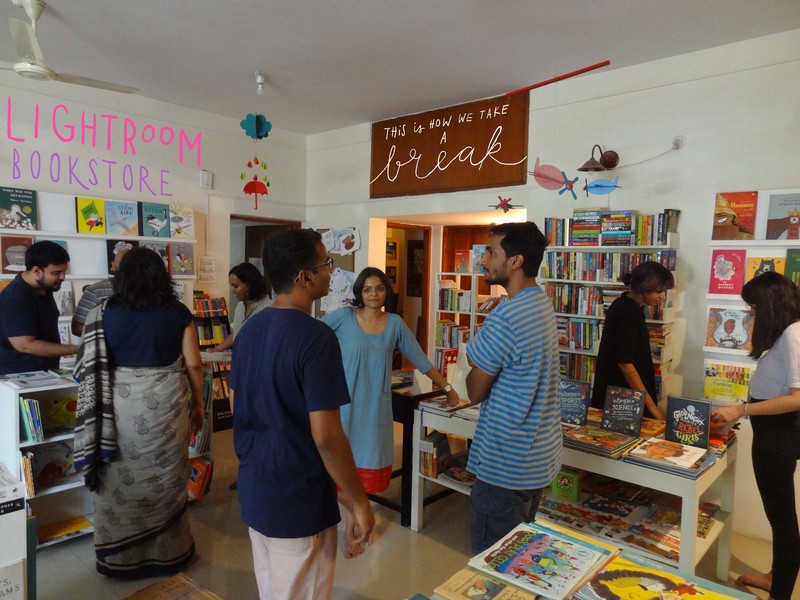
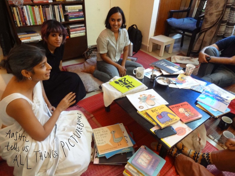
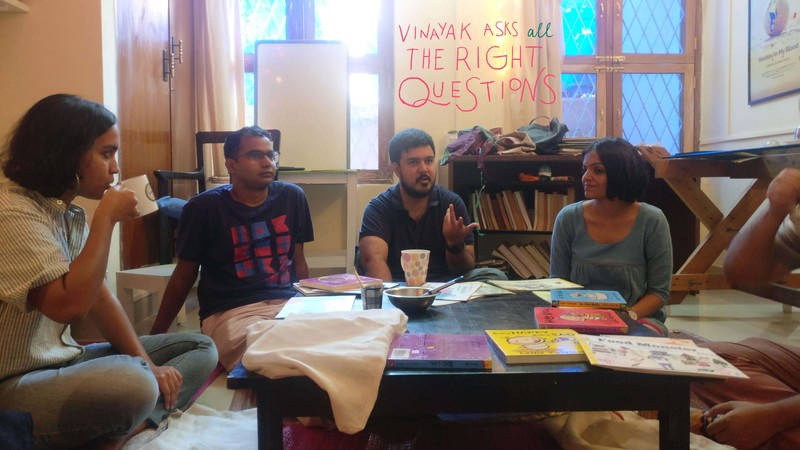
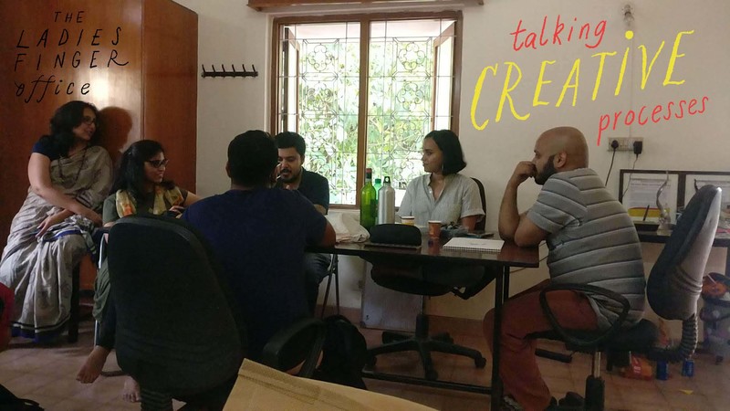
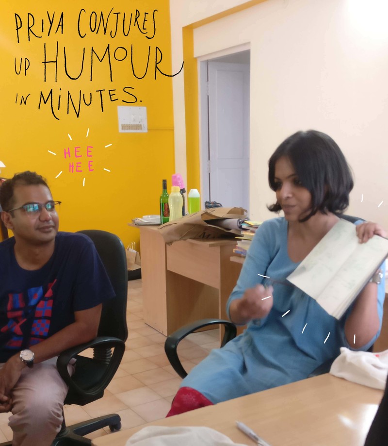
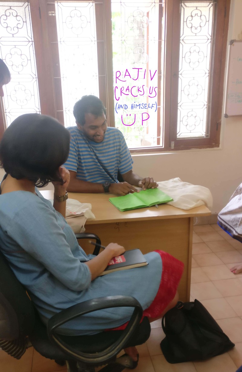
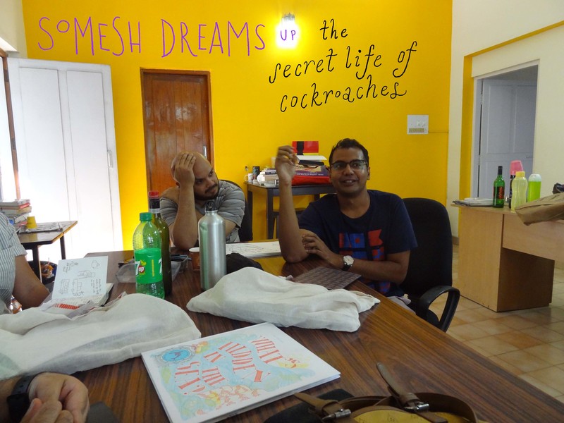
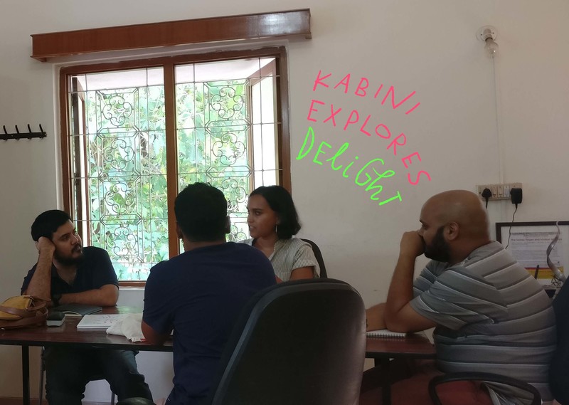
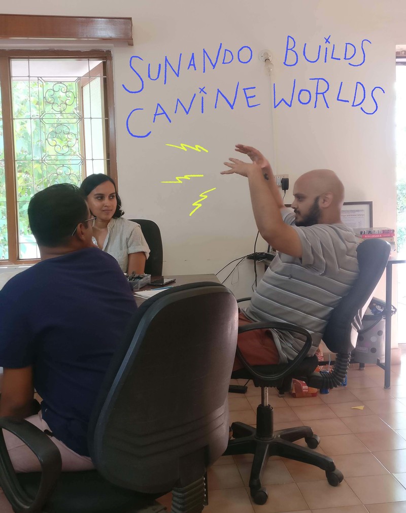
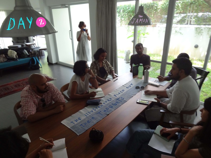
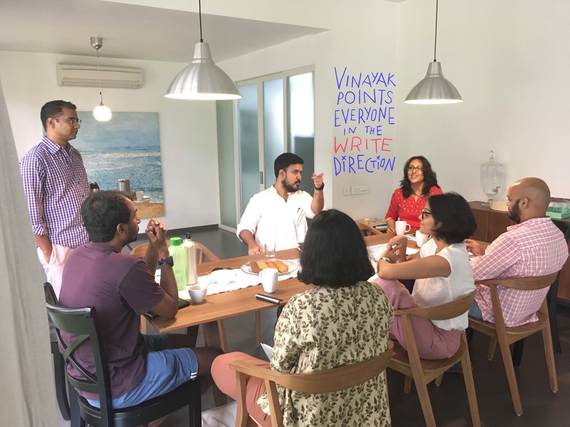
A huge thank you to the folks at Lightroom Bookstore and The Ladies Finger for hosting us.
comments (3)
"Since I love working with nature, this theme has trickled down to the various mediums I use" Artist Barkha Lohia on tattooing and illustrating
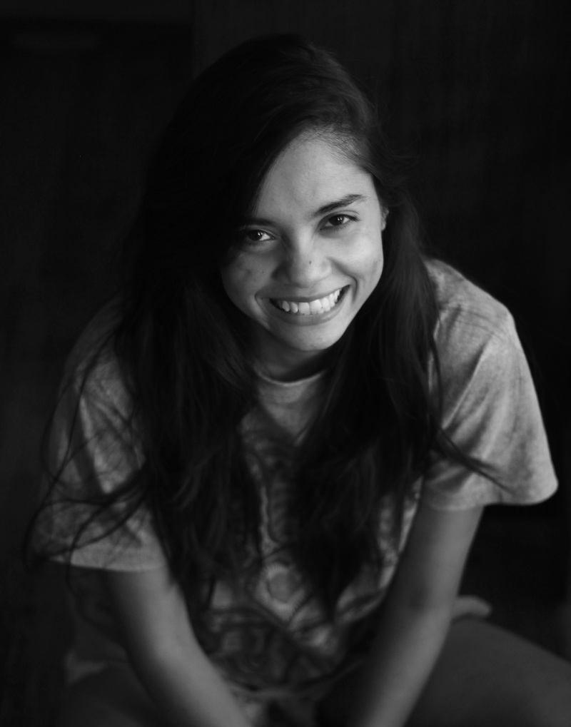
Posted by Yamini Vijayan on July 31, 2018Illustrator and tattoo artist Barkha Lohia has created stunning art in Walking in the Wild for Pratham Books this year.
Barkha lives in Gurgaon, Haryana. She loves working on morbid illustrations, tattoos, paintings of bird and trees and can be found drinking chai at any given time. She is currently working on a poem-based picturebook.
In this short email interview, Pratham Books' Assistant Editor Zeba Imtiaz talks to Barkha about her illustration approach and inspiration.
How do you find inspiration for your work?
I take inspiration from everywhere, but mostly nature. I love reading, so that influences my work as well. Then there are events in your life and people around you that also flow back into the work. Sometimes it’s a conscious decision, sometimes it just flows - without much thought about what should be the subject or the output.
We know that you are a tattoo artist as well. Could you tell us more about your journey as a tattoo artist - the decision to be one, what drew you to it, and so on?
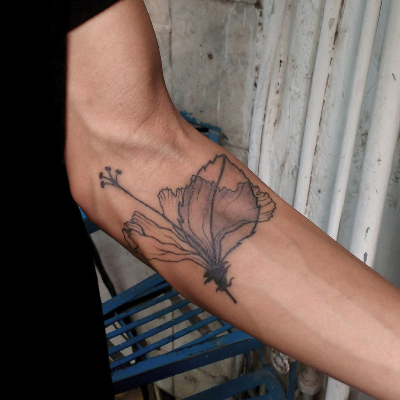
My maternal grandmother and paternal great grandmother had a lot of tattoos on their bodies. In India, communities have had a rich tradition of tattooing and the case was same here. As a child I was very fascinated with the ink on their body and would often ask them what it meant, or why they got it done. Growing up, shows like Miami Ink, LA Ink influenced me as well. The creative process of it all was really intriguing. How one took a concept and made something so personal for the client, to be permanently inked was very fascinating to me. Also, I really connected to this art form, I'd often keep doodling on myself or my friend's skin in school and college. I decided to go for it when I was working as an illustrator at my second job. I ordered a kit for myself to practice and decided later on to join a studio as well. It’s been great fun.
Do you find that your work as a tattoo artist influences your other work, or vice versa?
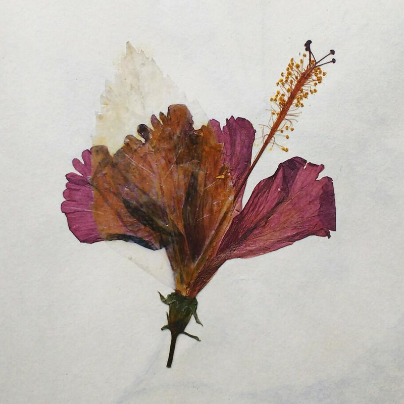
I don't think it has till date. In my case, since I love working with nature - the theme has trickled down to the various mediums I use - be it tattooing or illustration. I also feel that I'm still experimenting and not really down to one style, so I think I have the liberty to go at different styles in different mediums. With tattooing, you have to keep some aspects in mind while drawing - with regards to what will work on a live canvas. So, it has its own limitations and set rules that are not there for traditional illustrations for books and such. Illustration on paper, digital illustrations are more freeing.
Is this your first time illustrating for children? What do you most enjoy about illustrating for children, and what are the challenges?
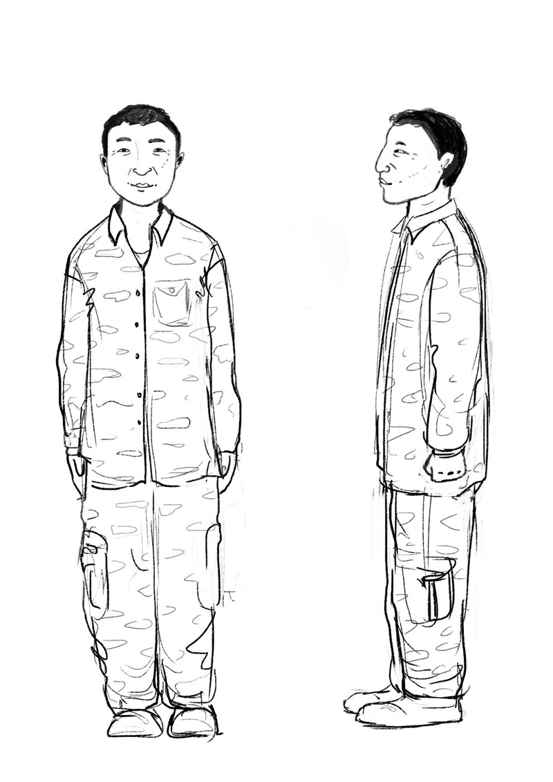
Yes, this was my first time illustrating for kids. I have worked on smaller projects before but not on a complete book. I learned a lot during the process and it was great fun. I remember as a kid, I would pore over pictures and paintings in books and really look at them for long hours. Simply in terms of story, what must this character be doing, why is this cat here in drawing, etc. I was just creating a different world altogether. And I think kids tend to do that. They will put more into text, drawing and story in more ways than we do. So, I was trying to create that. I can't say what works for them since this is my first time illustrating for them, but if asked to do something I'd probably make a completely wacky world for them, filled with strange characters, peculiar sights, familiar sights. They would connect more with a talking bird than we'd ever. I think my style would be like that. With this book, the challenge came with the brief to have a more realistic character rather than cartoony. So, mostly it was to get the real look of a forest and the ongoing events and to do justice to the story of Zakhuma. And still make it engaging for the kids.
What kind of preparation and research went into illustrating Walking in the Wild?
I was provided with a brief about the place and Zakhuma. I was given his picture and his daily activities and asked to make a character that was more realistic than cartoony. I developed the character of Zakhuma first and then later on worked on the surroundings of the forest. I looked through a lot of pictures and articles on Dampa tiger reserve and the forests in Mizoram to get a feel of the place. Same goes for the animals, birds in the story. Rough layouts were then made for the pages, which were then discussed with the art director - for suggestions and iterations before working on the final drawing. Similarly for colouring in the pieces, some rough coloured layouts were shared with the Pratham Books team to collectively decide on which would suit the overall theme better.
Walking in the Wild is filled with beautiful and detailed drawings of different animals. What did you most enjoy drawing?
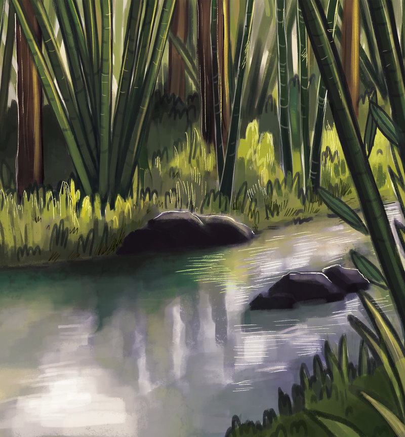
I really loved the scenes where different animal descriptions were to be given. I particularly enjoyed illustrating the opening scene and the moonlit scene of the Dampa forest reserve.
If you had to choose one medium for your art, what would you pick?
I don't think I can decide on one. I love working with different mediums. Each lends a different feel to the work. That being said, I enjoy doing more hand drawn stuff than digital - be it acrylics, oil paints, posters etc.
Who are some artists you admire?
There are many! When it comes to picture books - Shaun Tan is someone I'm really inspired by. His work is phenomenal. Lots of tattoo artists as well - Dzo Lama, Balaz Bercsenyi, Sol Tattoo in particular. Lots of Indian artists - Hemlata Pradhan, Rajiv Eipe, Sajid Wajid Shaik, Abhishek Singh. There are many actually. I can only think of a few right now.
How do you deal with creative blocks?
Not well. I don't like that part at all. I think I take to binge watching T.V. series and books to get over it and walks.
You can read Walking in the Wild on StoryWeaver for free. This is available in Hindi, Marathi, Kannada, Tamil, and English.
Be the first to comment.Playing with Food
Posted by Remya Padmadas on January 25, 2018Aindri is a communications designer specializing in narrative illustration and animation. She is one of the members of The Kadak Collective. She has illustrated two books for Pratham Books: Apu's Giant Earthquake by Sudeshna Shome Ghosh and Food Monster by Meenu Thomas. Both the stories are very to read, download, print and share on StoryWeaver. Aindri writes about how she created the distinctive textured illustrations for 'Food Monster'.
Meenu’s story Food Monster instantly reminded me of the potato and bhindi block printing classes I had in school. I felt the same approach and materials would go perfectly with her story.
When returning to that memory, I came across the technique of Gyotaku (gyo “fish” + taku “rubbing”) a traditional Japanese method of fish printing that originated in the mid-19th century as a way for fishermen to record the size and characteristics of their daily catches. So block printing with food was not just child’s play. Infact, before cameras, fishermen often recorded large or unusual specimens by making ink block reproductions of their catch. The Sumi ink which was used to take the impression would be easily washed away after recording the catch, so the fish was in perfect condition to be consumed. (You can read more about Gyotaku here and here.)
Video: Gyotaku by Naoki from YouTube
I scanned the images which I later layered and collaged with hand drawn illustrations.
Some of the shapes were easy to spot, like the circles and rings in the cross-section of peppers and cucumbers, some impressions especially of the herbs looked like tiny version of trees and some impressions like strawberries made seamless patterns on the page. Here are impressions of strawberry and corn:
A fairground favourite, the carousel, made with celery, lemon, basil, pepper & pepper seeds.
A panipuri stall near a tree: made with basil, corn, cucumber, celery and garam masala.
Aindri has generously shared a library of the prints she created for our community to use.You can find them on Aindri's profile page (scroll down to see them all!)
You are most welcome to use them as you wish, do please tag us @pbstoryweaver and @aindri_c with your favourite food shape. Good luck!
Be the first to comment.